Project Brief
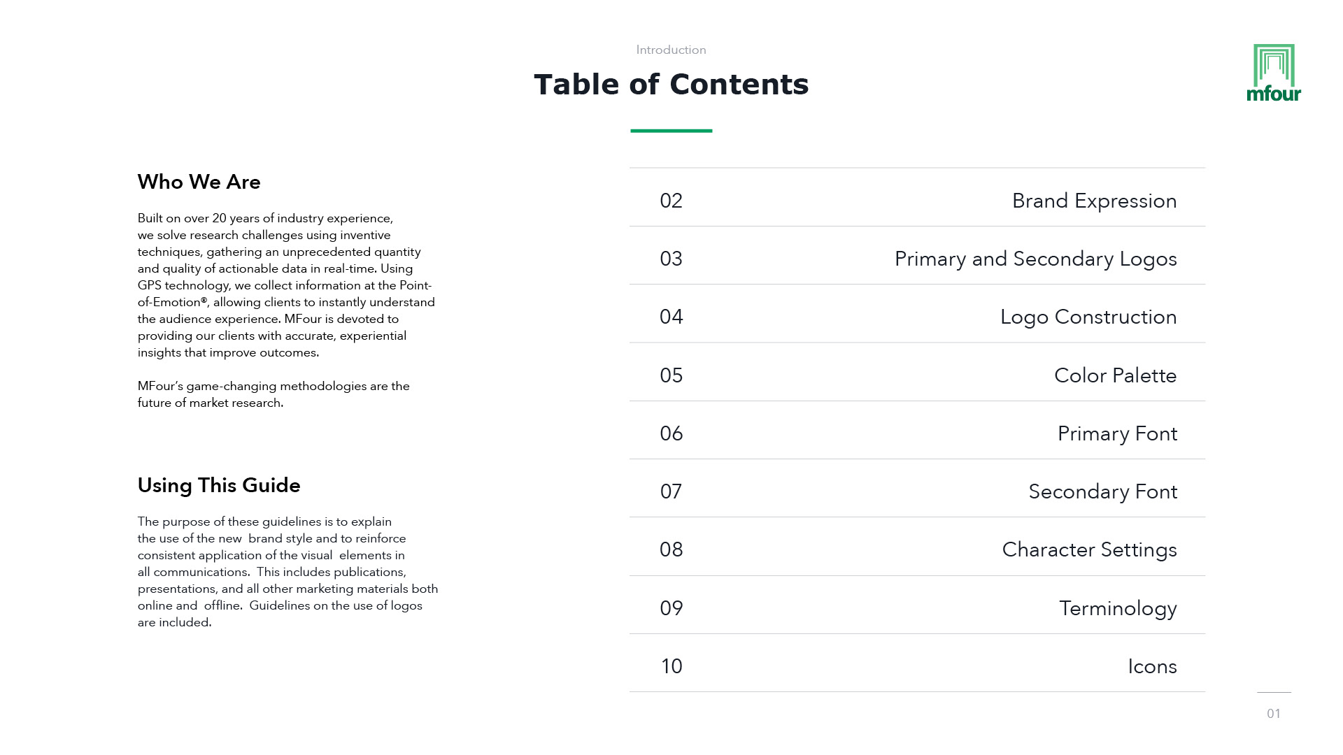
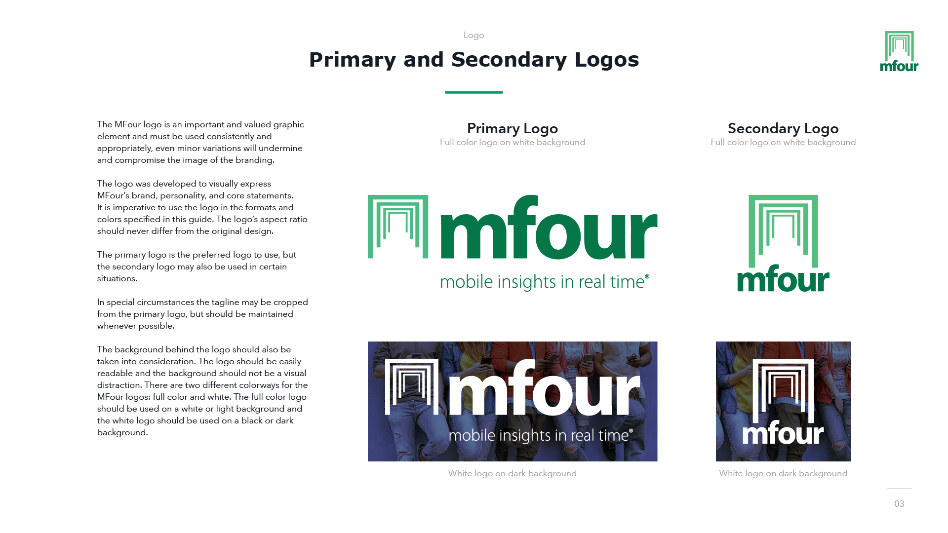
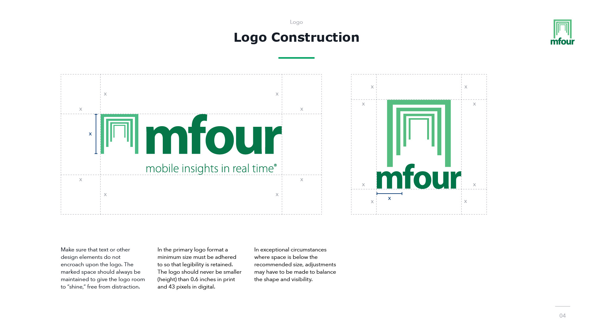
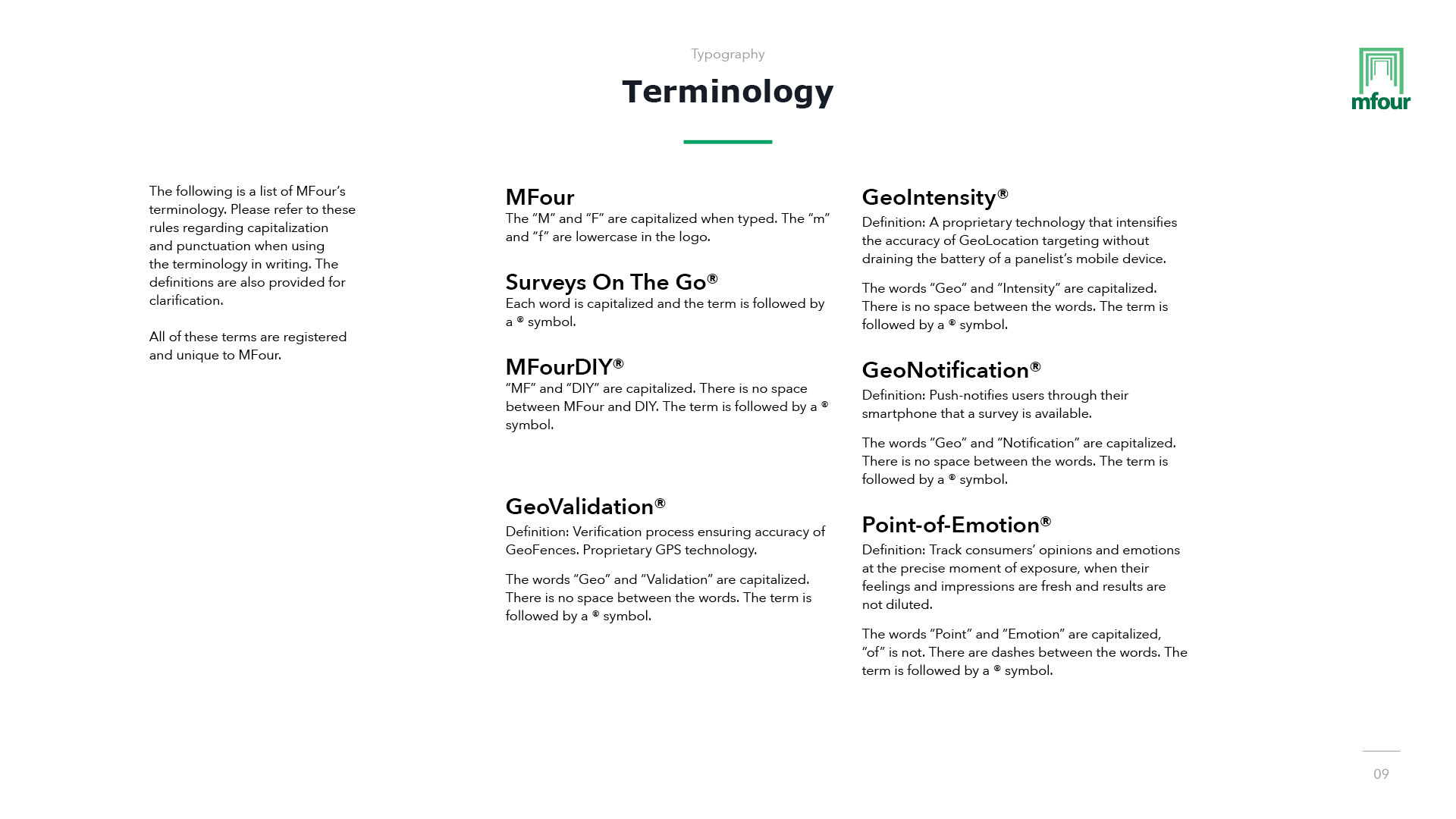
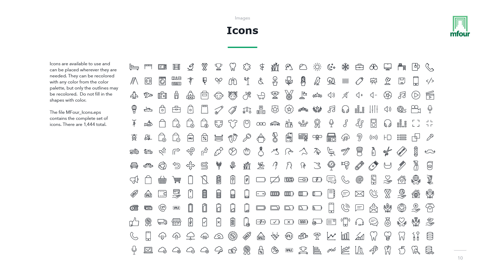
The updated logo and brand guidelines for MFour Mobile Research.
Concept
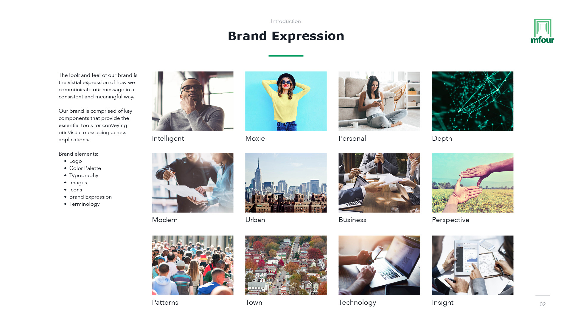
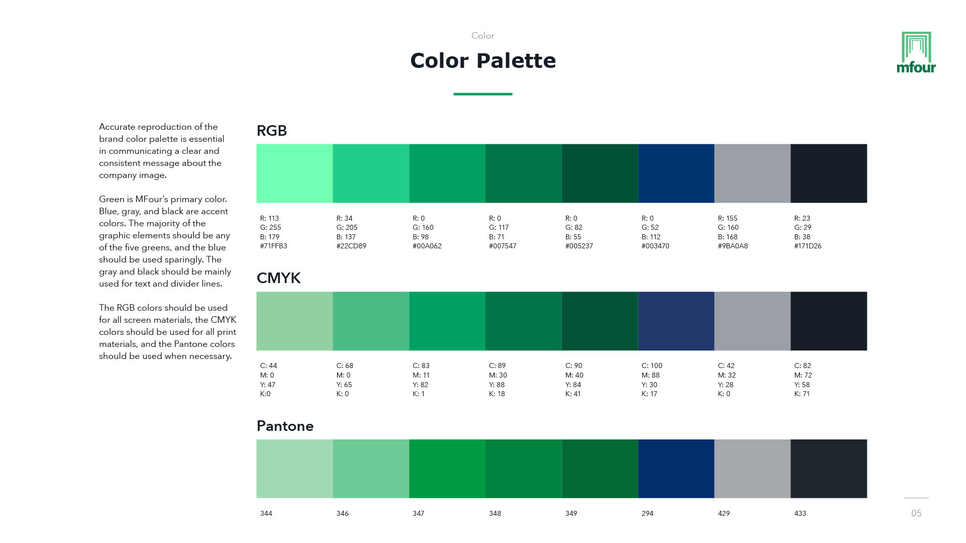
For this project, I updated MFour’s brand and created a set of brand guidelines. MFour wanted to keep their existing logo but they wanted their brand image to be freshened up. The original color palette contained only three different greens, a gray, and black. I expanded their color palette to include several different greens, a blue, and a new gray and black. MFour’s brand focuses heavily on their green, but I added the new blue to provide some contrast and variety.
